Posted by Laura | June 21, 2015
Epic Vancouver WIP
Work-In-Progress shots of a large painting of Vancouver’s Downtown East Side and the North Shore mountains.
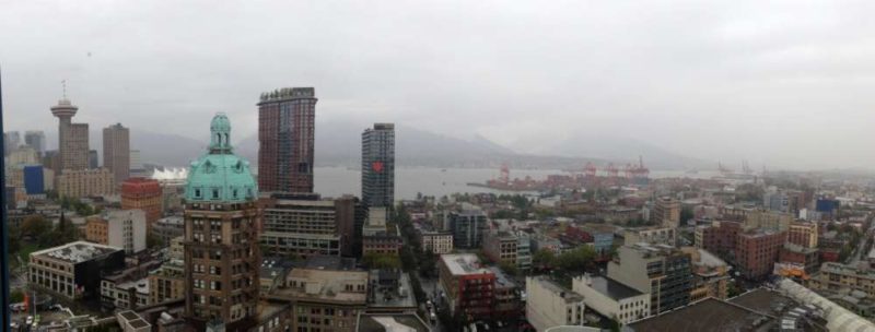
The View: The clients have lived in their longstanding Keefer Place high rise at least two decades before gentrification started and their view is spectacular. I can see all the major iconic landmarks in the West End and Downtown East Side. Everything is framed by the mountains and mist. It’s like a dozen of the paintings I’ve already done on one canvas. They want a look that is a little darker and grittier than my usual hysterical color scheme, which means more texture and transition and less cartoony rainbow. There will be color, of course, and my usual distortion to make it all fit in. I’m pretty excited about this. There’s a reason why I keep my “Color of Industry” painting in my own personal collection.
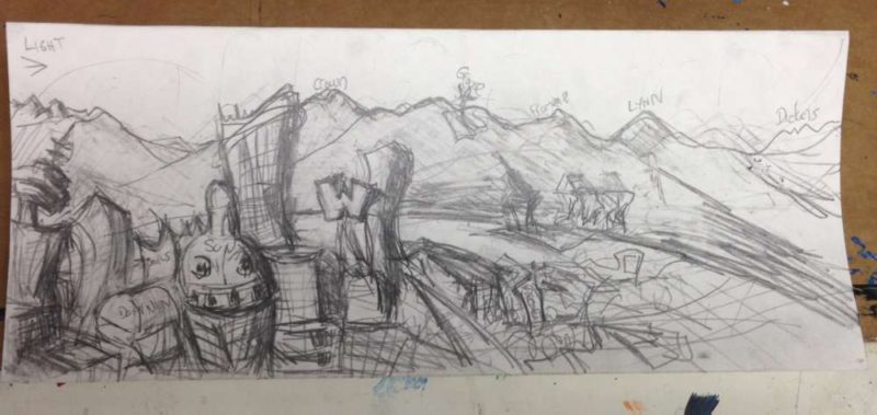
Rough Sketch. I’ve been dying to start so my rough sketch is *really* rough. Sometimes I do a full-color scale thumbnail but I’m getting impatient to get to work so I only wanted to figure out the framing and which points to emphasize. The “W” is a big point of emphasis, as well as the Save On Meats sign and the cranes.
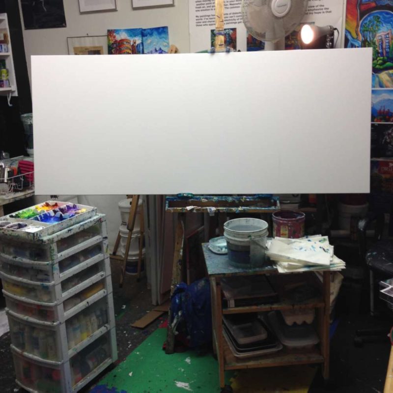
The Always-Intimidating Blank Canvas. Wow. Few things are more intimidating than a big blank canvas onto which you have to empty the contents of your head. Coherently. This one is 72″ wide by 30″ high. Custom-made, too, so don’t screw up, Laura!
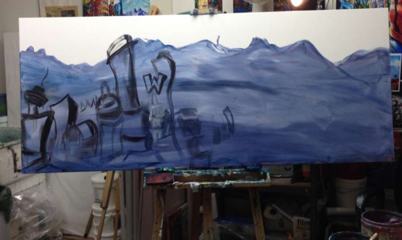
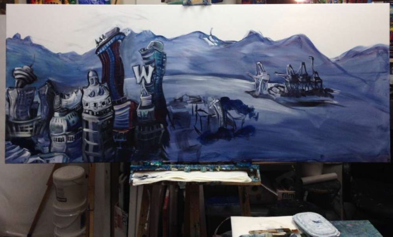
First Session: Attack. I throw on some Payne’s Grey wash and add the peaks quickly. I know them all like the back of my hand; I could paint them in my sleep. Then I need to figure out the relative size of the buildings and how to exaggerate the ones that seem significant.
Tonal Focus: Man, there are a lot of buildings. Dominion. Sun tower. W2. Harbour Center. I wonder if I should have been more careful and done a grid of the Downtown East Side, because I don’t want it to be overwhelmed by the West.
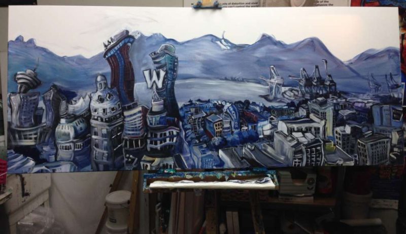
Grisaille: This is the grisaille stage, which is the term for tonal underpainting. It’s NOT DONE yet but it gives a good idea of the foreground detail and background atmosphere. I’m going for a curvature of the earth perspective because that gives a “My World” view. Everything from here on in is like a lens focusing. Next: color and texture.
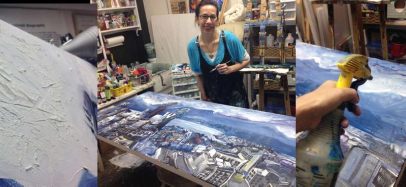
Texture! This is a hard part to describe. What I do is build up texture on the sky part of the canvas and then after it dries, I apply pockets of high-intensity pigment (Alizarin Crimson, Titanium White, Payne’s Grey), and then mist streams of water haphazardly. It blends and runs unpredictably. This is the best way I know to make a truly random sky. I find that we humans love patterns and repetition and we unconsciously copy our own favorite design over and over again but that’s not how nature looks. Clouds and mist are best created spontaneously, accidentally, and with as little control as possible.
Color! Now the sky has some emphasized cracks and fissures. I’ll fiddle with the mist a little more but I really want to add some color. I want it to look stark, almost Film Noir, but I also have to build up the bottom foreground so the impasto is at least as thickly textured as the sky. I’ve sculpted buildings out of molding paste in the foreground. Funny note on landmarks. I was worried about my unconscious tendency to personify buildings and the Sun Tower kept taking on a devilish cast. I was told by the view’s owner that, yeah, that building has a bit of a dark side so a touch of devilishness is entirely appropriate.
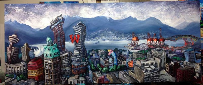
Detail. It takes time I’m working west to east, and still much to be done. I’ve decided to put *everything* in and then selectively tone parts down to make it starker. Right now, everything’s a point of focus: the Dominion building, Sun Tower, the “W”, the Save On Meats Sign, the Army & Navy sign, the cranes, the Balmoral, and the Ironworker’s bridge. I’m going to fiddle with the lighting and color emphasis and add more “grit”. The east side foreground definitely needs more darkness and grit. Stay tuned. This is going to get much more interestingly lit.
Now, Kill Your Darlings. Once I have the detail in, I figure out which parts will stand out and which parts won’t. This is where the whole narrative of the painting forms.
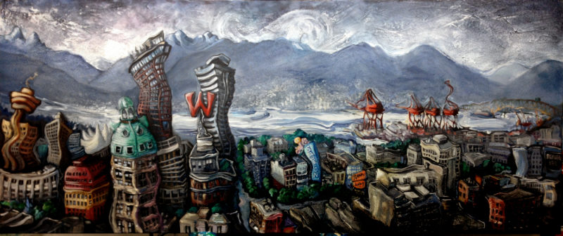
When I work on my brighter pieces, there’s a stage at the very end that I call “Lighten, Brighten, Tighten.” “Lighten” means emphasize highlights, “Brighten” means layer colors so they’re brighter, and “Tighten” means fine-tune the brush strokes and detail. This painting needs almost the opposite because I’m going for more of a Film Noir effect, something like my Color of Industry painting,  but with just a bit more color. So this step is more like “Darken, Starken, and…” something else, but I can’t figure out a third word that rhymes. “Darken” means I’ll make the foreground elements dark and forbidding. “Starken” means make the lighting lower and strip out the detail, even though I hate doing that. Maybe the third part is “Smarten, ” which means “simplify the story.”
It’s difficult to take detail OUT because you fall in love with it. But all of it, at once, is just too damn busy, visually. William Faulkner said, “In writing, you must kill your darlings,” and this is what I do now. I use my small-screen camera phone to see what stands out. I squint a lot. Sometimes I paint in really dim light at night so I’m braver about reducing the stuff that just doesn’t matter.
So what changed from the previous version? The Lions got bigger, the cranes got darker, the foreground became shadowy and the buildings became more squashed, like they’re collapsing under their own weight. I added mist and activity on the water and increased the contrast between the foreground and background. The foreground is dark and ominous and the background is indistinct. That works for a visual metaphor if the foreground represents “now” and the distant background is “future.” The Save On sign is perfect here, plus there’s the “You won’t believe what’s in store!” Army Navy sign. There’s the story.
Last stage is to clean the whole thing up and add a few miniature personal touches, like a certain dog in a window and an eagle’s nest on the W. This is stuff most people won’t see unless they see the painting itself.
It’s a painting about redemption, once I figure out the words.
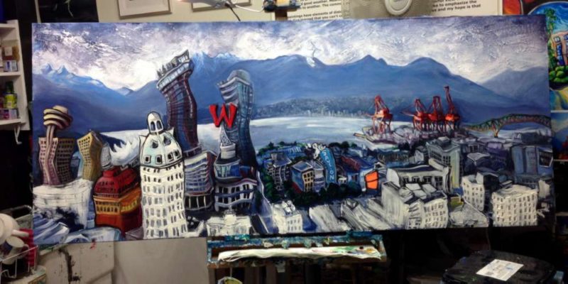
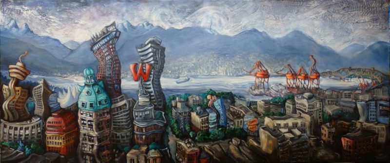
Ta-DA! It’s done. It hasn’t been varnished yet but this is what I sent for a final proof.
I added some hidden detail that you probably can’t see (a dog in the window, an eagle’s nest on top of the W) and played with the lightness and brightness of the elements. I try to imagine a beam of light hitting the most important parts of the picture and adjust the path of light. For this scene, the elements to lead the eye along the path are the far-right Harbour Centre, the Sun Tower, the W, Save On, and then the Cranes. The foreground stayed mostly dark with a warm wash. The mountains got a little more faded and less distinct. The water is smoothed out, and so are the highlights in the sky.
What makes it “done” is another process in itself. I email a work-in-progress shot to myself and then go home and stare at it on my tablet or phone for an hour or so making mental notes about what stands out that shouldn’t. That’s my to-do list for what needs to be fixed the next day, e.g. the cranes are too dark, the landscape is tilted, the mountains need more mist, and so on. When there’s nothing left to fix, it’s done.
Then I come up with a title if I don’t have one already and do a writeup, which is basically the “story” of what the painting represents and any symbols I included. Once the customer approves the proof, I varnish it.
And that’s how a painting goes from start to finish.

